K-Means Clustering: Height/Weight
Previously, I posted about several examples of supervised learning algorithms, such as k-nearest neighbor. In this post, we will look at k-means clustering, an example of an unsupervised-learning clustering algorithm, using Scikit-learn. But first, I will explain the differences between supervised and unsupervised learning methods, before I describe more about unsupervised learning.
Unsupervised vs Supervised Learning
Supervised learning, in short, is training a model with labeled training data to allow it to extrapolate labels on previously unencountered data. There are two main types of supervised learning methods.
-
Classification
-
Regression
Even though both are supervised learning methods, classification involves separating training data into discrete categories, whereas regression output is usually numbers or other continuous output variables.
Several examples of supervised learning include: artificial neural networks, decision tree learning, naïve Bayes classifier, nearest neighbor algorithm, and SVM machines.
On the other hand, unsupervised learning involves finding patterns from a group of unlabeled data to classify them based on common or similar traits. There are two main types of unsupervised learning methods.
-
Principal component analysis
-
Cluster analysis
Even though this post will not go into too much detail on principal component analysis, it is essentially an algorithm that reduces data dimensions for purposes such as visualization. Cluster analysis, put into simple words, is grouping together similar data into a class.
K-means clustering procedures
K-means clustering algorithm sounds quite similar to the k-nearest neighbor algorithm. There are important differences between the two though–for one, the latter is an example of supervised learning, whereas the former is an example of unsupervised learning. K-nearest neighbor looks at the relationship between the new data point and the k-nearest neighboring points, and based on the labels on those points, it classifies the new data point. On the other hand, k-means clustering attempts to divide unlabeled data points into k-number of clusters.
K-means clustering algorithms usually take the following steps.
- Prepare data
- Choose the number of classes (k)
- Choose the initial centers of the clusters
- Sort data into the nearest clusters
- Change the initial cluster centers to cluster centroid
- Repeat steps 4 and 5 until the cluster centers do not change
A common problem associated with k-means clustering, however, is closely related to step 3–choosing the k initial centers. Often, when computer-generated clusters undergo human inspection, one may notice that the clustering is counterintuitively incorrect. To avoid this error, in Scikit-learn, the kmean++ algorithm sets initial cluster centroid points in a relatively more efficient way–by setting the initial centroids to be the points farthest away from each other. If one chooses to randomly set the initial centroid points, a more accurate clustering result may be available from calculating the sum of the total variation for each cluster. By minimizing that sum, one usually gets the most accurate and intuitive clustering result.
In a similar fashion, if one is not sure about the ideal number of classes (k), one may consider the k value that minimizes the sum of the total variation in each cluster. There is a catch though–if k is the total number of data points, (that is, if each cluster consists of only one point) then that sum is zero. Therefore, one must consider the sum of total variation per k. The following picture shows the reduction in the sum of total variation per k, plotted against k values. The “elbow point,” or the point where the most drastic increase in this reduction occurs, is when k is three–and hence, the ideal value of k should be three.
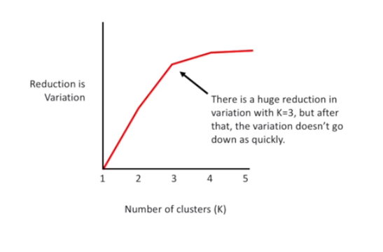
This picture was taken from one of StatQuest’s public-domain tutorials on k-means clustering. Below is a demonstration of k-means clustering with nine data points, using Scikit-learn.
import pandas as pd
import numpy as np
from sklearn.cluster import KMeans
import matplotlib.pyplot as plt
import seaborn as sns
%matplotlib inline
df = pd.DataFrame(columns=['height', 'weight'])
df.loc[0] = [185, 60]
df.loc[1] = [180,60]
df.loc[2] = [185,70]
df.loc[3] = [165,63]
df.loc[4] = [155,68]
df.loc[5] = [170,75]
df.loc[6] = [175,80]
df.head(7)
| height | weight | |
|---|---|---|
| 0 | 185 | 60 |
| 1 | 180 | 60 |
| 2 | 185 | 70 |
| 3 | 165 | 63 |
| 4 | 155 | 68 |
| 5 | 170 | 75 |
| 6 | 175 | 80 |
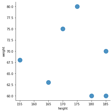
sns.lmplot('height', 'weight',
           data=df, fit_reg=False, # data is df
           scatter_kws={"s": 200}) # "s": 200 marks size of dot
<seaborn.axisgrid.FacetGrid at 0x25d53dcc1f0>
data_points = df.values
kmeans = KMeans(n_clusters=3).fit(data_points)
print(data_points)
print(type(data_points))
[[185 60]
 [180 60]
 [185 70]
 [165 63]
 [155 68]
 [170 75]
 [175 80]]
<class 'numpy.ndarray'>
kmeans.cluster_centers_ # shows centers of clusters in graph above
array([[172.5, 77.5],
       [183.3, 63.3],
       [160., 65.5]])
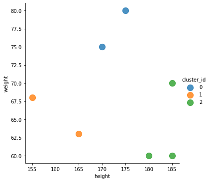
df['cluster_id'] = kmeans.labels_
# kmeans.labels_ added to another column of df, under name 'cluster_id'
print("This is kmeans.labels_", kmeans.labels_)
sns.lmplot('height', 'weight', data=df, fit_reg=False,
           scatter_kws={"s": 150},
           hue="cluster_id")
<seaborn.axisgrid.FacetGrid at 0x25d53cc7be0>
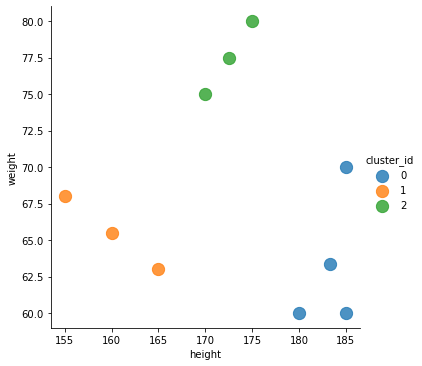
As is visible from the graph below, the data points have been grouped into three classes based on height–small, medium, and tall. For the sake of visualizing the centroids of each cluster, I added points 7, 8, and 9 to the list, and the updated graph is shown below this graph.
df1.head(15)
# df1 is a new dataframe object containing the centriods of clusters
| height | weight | cluster_id | |
|---|---|---|---|
| 0 | 185 | 60 | 0 |
| 1 | 180 | 60 | 0 |
| 2 | 185 | 70 | 0 |
| 3 | 165 | 63 | 1 |
| 4 | 155 | 68 | 1 |
| 5 | 170 | 75 | 2 |
| 6 | 175 | 80 | 2 |
| 7 | 183.333 | 63.3333 | 0 |
| 8 | 160 | 65.5 | 1 |
| 9 | 172.5 | 77.5 | 2 |
sns.lmplot('height', 'weight', data=df1, fit_reg=False,
           scatter_kws={"s": 150},
           hue="cluster_id")
<seaborn.axisgrid.FacetGrid at 0x25d53d54ca0>
As can be seen from the graph above, there are three additional points in the graph, with one for each cluster. The additional points are the centroids for each cluster, as calculated by the k-means clustering algorithm.
This is the end of the post! As always, thank you for reading.